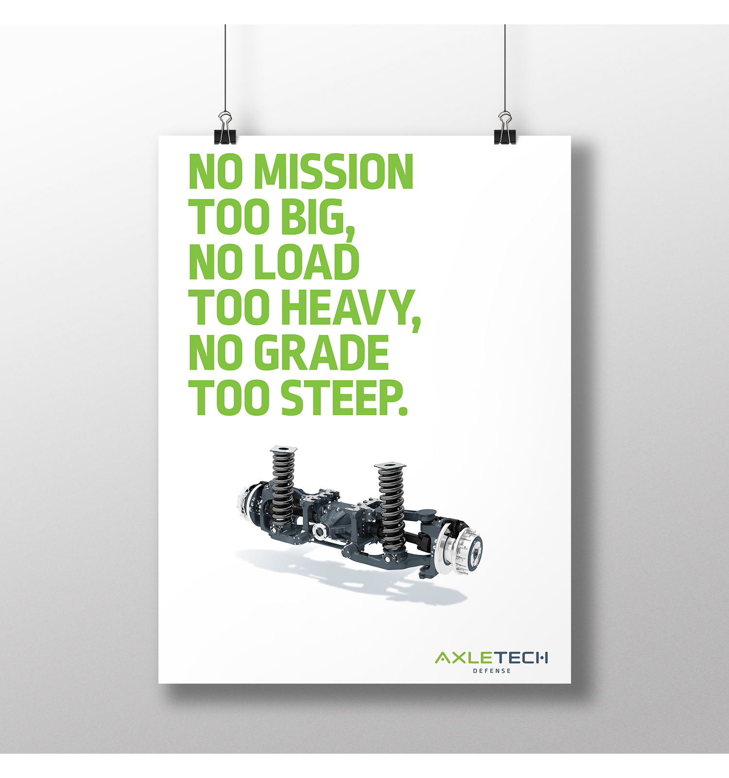
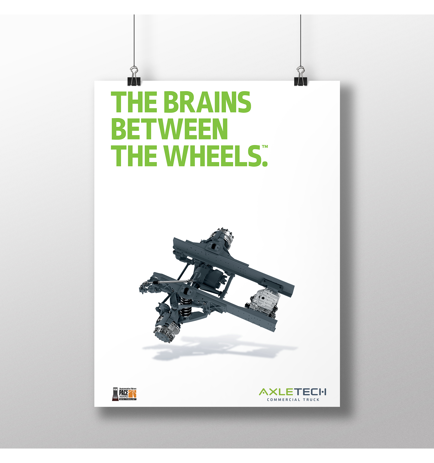
AxleTech
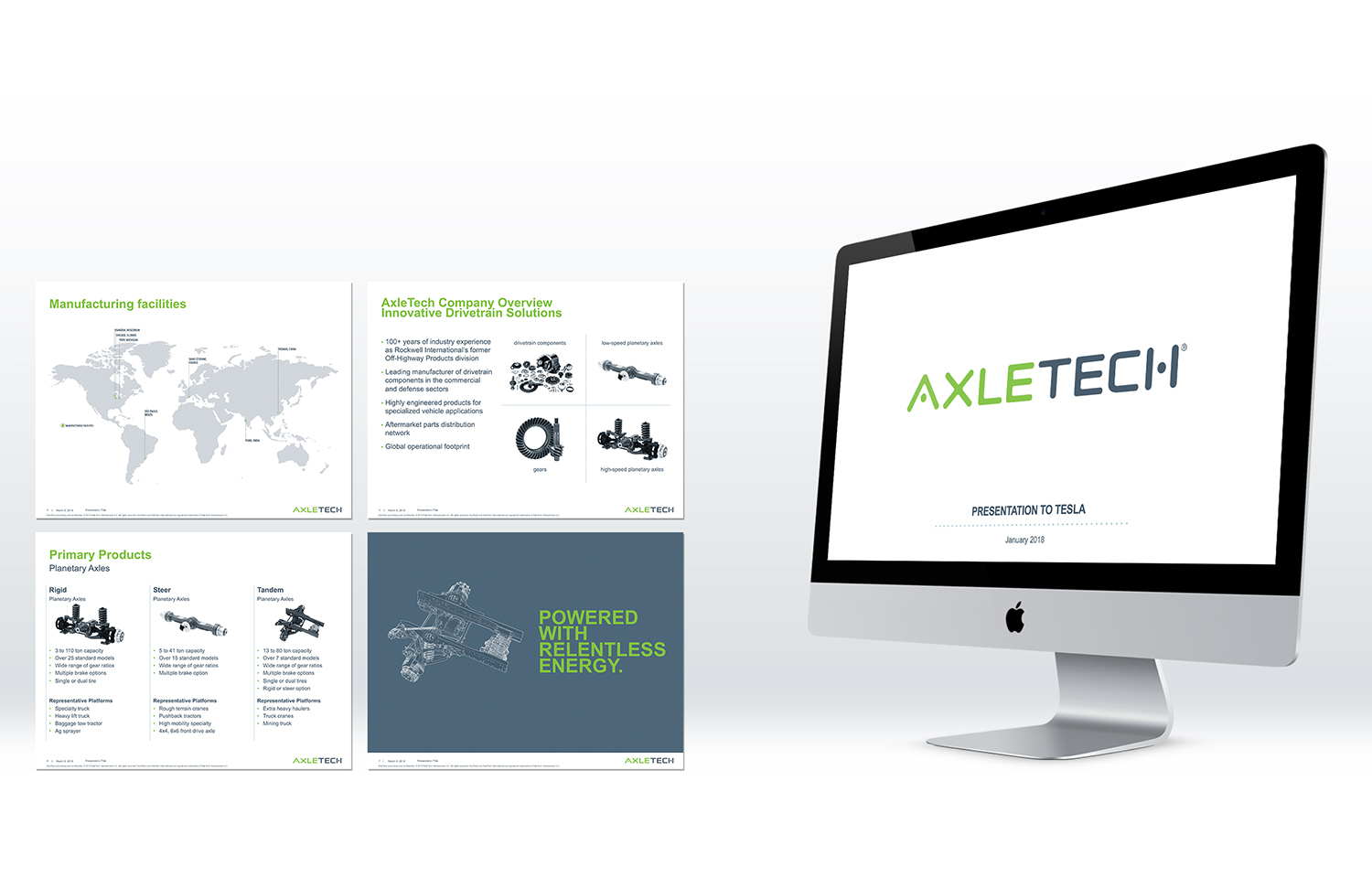
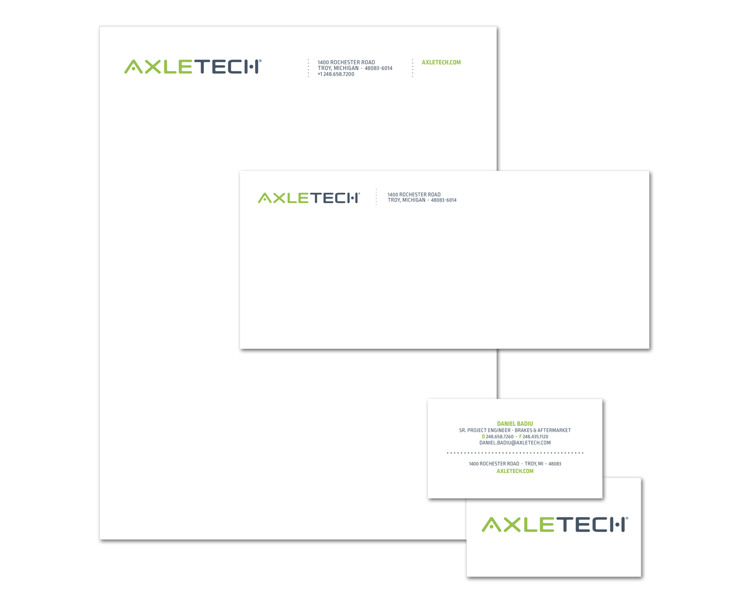
We completely rebranded AxleTech, from their logo on up, in just four months. This Detroit-area company was known as a manufacturing company (axles, brakes, powertrains for military, mining and farming vehicles, and bigger on-road vehicles). But they wanted credit for being a technological leader, especially for their electric powertrain solutions.
With electric, AxleTech was taking a giant step forward technologically. We designed a logo that should serve them well for decades. The circles in the A and H represent “between the wheels,” where AxleTech truly excels.
In this 55-second brand video, you get a good idea about the AxleTech energy and drive.
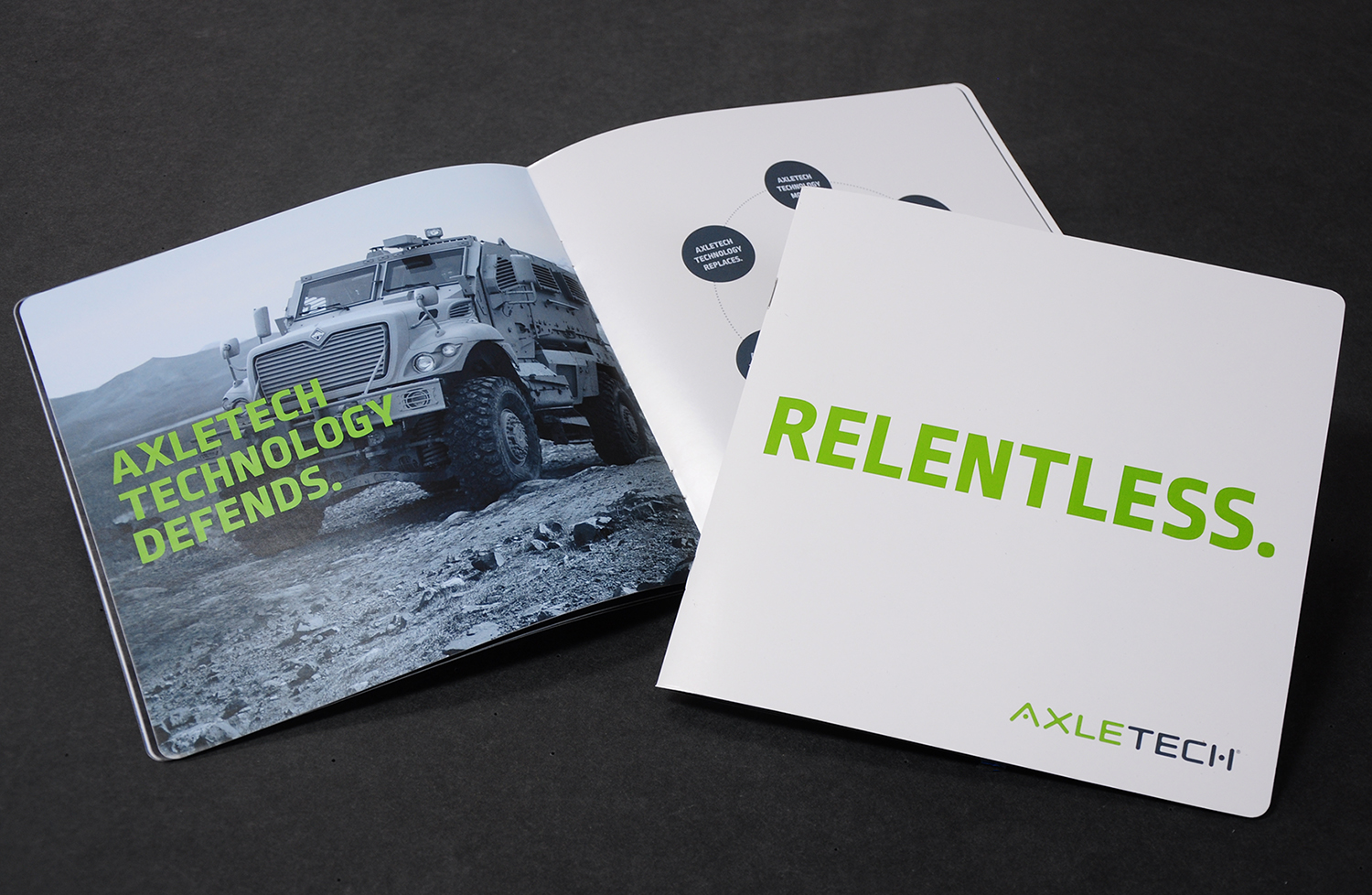
In our Adverthinking brand discovery process, one word was used by several of AxleTech’s top people to describe the company’s soul. That word is the title of their brand book.

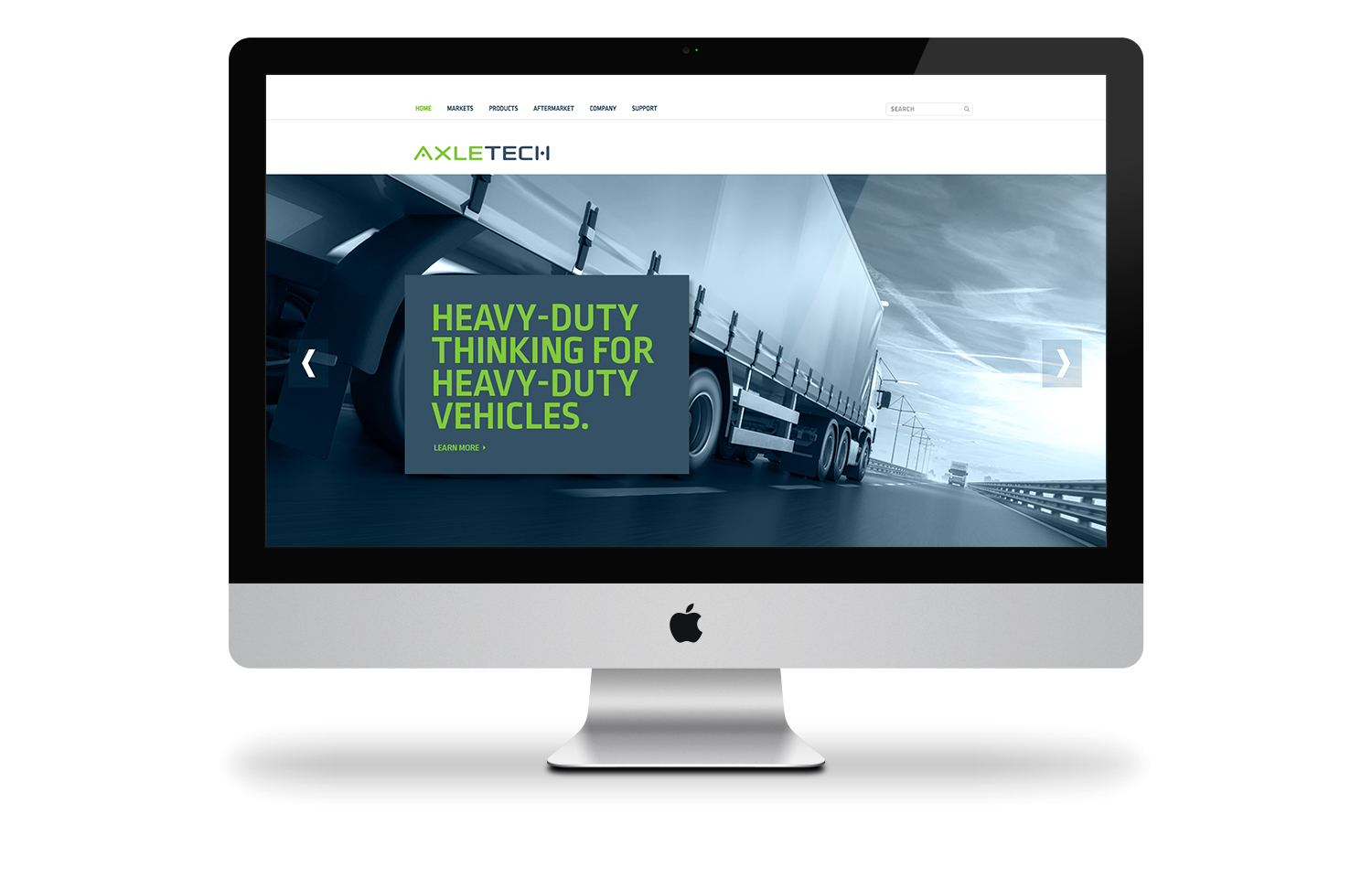
We designed a new homepage and reskinned AxleTech.com from stem to stern, to match the rest of the new brand.